ArgoCD 2.1 Filters hide a lot of information #7520
Description
Summary
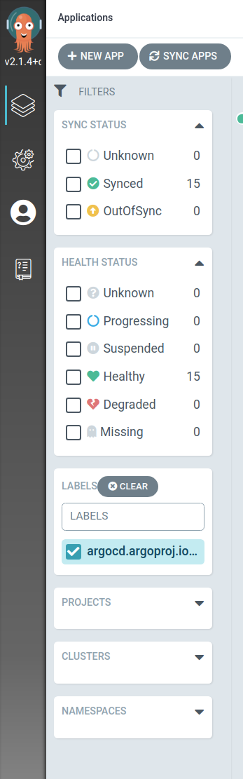
Labels used in filters used to either wrap or float within the filters pane.
In 2.1 with the new filter sidebar, it cuts off a lot of the label making it harder to use.
The clear button also doesn't look quite right in the window.
Motivation
Don't hide filter information.
Proposal
Either wrap and expand the label if it overflows the panel or make the entire side filter panel resizable?
Doing a hover popup might work, but for long labels it'd basically make their display at all kinda useless since all the important information is at the end when you use labels like app.kubernetes.io/name: my-app