Redesign: Too Many Items in More Menu #3085
Description
The original More Menu in the redesign has far fewer items than the current hamburger menu in Hubs.
Design:
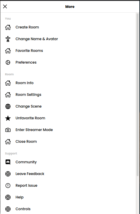
Current Implementation:
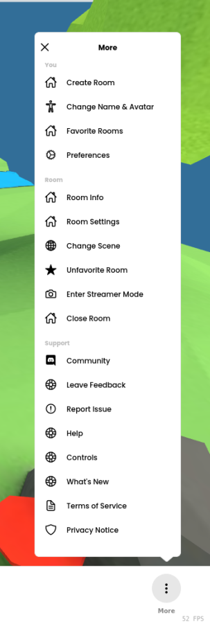
(Note some of the icons are duplicates, I'll need to find icons for them before we ship this)
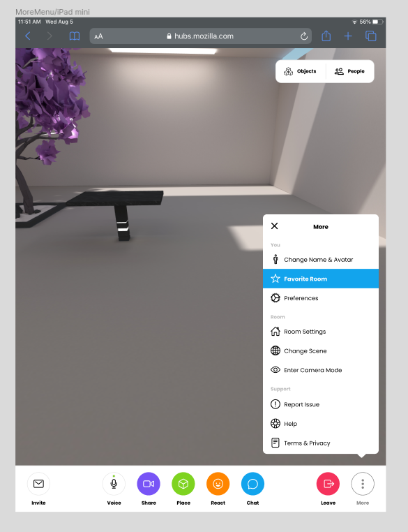
The number of menu items isn't a problem on narrow windows, the popover takes up the whole screen and scrolls on the small breakpoint, however on shorter windows it goes outside the window without overflowing vertically.
Mobile:
Short Window:

This is a bug in the implementation. We can make the popover fit within the window and scroll when it is too short. However, in my opinion, there are too many items in this menu and scrolling in popovers should be avoided.
Here are my thoughts on the different sections:
You:
- Favorite Rooms may not belong here. Your favorite rooms are already on the Hubs home page. There's no explicit page or section for them though. Perhaps we need one.
- We really need to add a login/logout button here. I've removed it from the people sidebar and it really should move here instead.
Room:
- Room Info is currently shown for all users as long as the room has a scene that was created in Spoke (most scenes are). We could show this item only if you are not a room moderator. For room moderators, we can make all of this info available in the Room Settings sidebar.
- Change Scene could probably be relocated to the Room Settings sidebar. I think people would naturally navigate there to change the scene for the room.
- Enter Streamer Mode isn't really clear what it does. I had to ask and find out myself. We should move this somewhere where we can give it a full description of what it does.
- Close Room could likely go under Room Settings as well. It should be given the big red button it deserves 🙂
Support:
- Leave Feedback and Report Issue lead to different flows, but we really should have some screen that helps you choose between the two. It's not super clear if I don't like something, which one of these options I should pick. Or if something is broken, I may gravitate to "Report Issue", but others may pick "Leave Feedback". Maybe we put all of this in our docs, and make an awesome landing page containing descriptions that lead people to each flow.
- Controls should probably make their way to the preferences screen. It makes sense to have them in the docs as well, but most games have them under a controls tab of the preferences page where you can usually change them.
- What's New can probably just exist on the home page and as a tip in the new loading screen.
┆Issue is synchronized with this Jira Task