Description
Hello,
I am using Gatsby in combination with prism-react-renderer and I've come across an issue which is stumping me. I am attempting to avoid FOUC in prism-react-renderer when implementing a dark / light mode by injecting the dark class into my HTML before rendering the page via gatsby-ssr.js, like so:
gatsby-ssr.js
exports.onRenderBody = ({ setHeadComponents, setBodyAttributes }) => {
  setBodyAttributes({
    className: 'bg-white dark:bg-midnight-express',
  });

  setHeadComponents([
    <script
      key="theme"
      dangerouslySetInnerHTML={{
        __html: `(function() {
            function setTheme(theme) {
              window.theme = theme;

              if (theme === 'dark') {
                document.documentElement.classList.toggle('dark');
              }
            };

            let preferredTheme;

            try {
              preferredTheme = localStorage.getItem('theme');
            } catch (e) {}

            let darkQuery = window.matchMedia('(prefers-color-scheme: dark)');

            setTheme(preferredTheme || (darkQuery.matches ? 'dark' : 'light'));
          })();`,
      }}
    />,
  ]);
};
While this all works fine for the page theme itself, the issues crop up with my CodeBlock rendering--as you can see in the code below, when I set the default theme I first check whether we have a window -- if we do, I check whether the document.documentElement.classList contains our dark theme--if it does, we set this as the default theme. If our window is undefined, such as during the SSR, we simply return the light theme. This code works perfectly in development mode, and even appears to work perfectly when being served as a static bundle, unfortunately the Highlight component renders the wrong theme even when receiving the correct props. Please see below:
CodeBlock.tsx
/* eslint-disable react/no-array-index-key */
import React, { useState } from 'react';
import Highlight, { defaultProps, Language } from 'prism-react-renderer';
import lightTheme from 'prism-react-renderer/themes/vsLight';
import darkTheme from 'prism-react-renderer/themes/palenight';
import Themes from 'constants/Themes';

interface CodeBlockProps {
  children: {
    props: {
      children: string;
      className: string;
    };
  };
  className: string;
}

export const getInitialTheme = (): Themes => {
  if (typeof window !== `undefined`) {
    return window.document.documentElement.classList.contains(Themes.DARK) ? Themes.DARK : Themes.LIGHT;
  }

  return Themes.LIGHT;
};

export default ({ children }: CodeBlockProps) => {
  // Pull the className
  const language: Language | string = children.props.className?.replace(/language-/, '') || '';
  const themes = {
    [Themes.DARK]: darkTheme,
    [Themes.LIGHT]: lightTheme,
  };
  const [theme] = useState<Themes>(getInitialTheme());

  console.log('theme: ', theme);
  console.log('themes[theme]: ', themes[theme]);

  return (
    <Highlight
      Prism={defaultProps.Prism}
      theme={themes[theme]}
      code={children.props.children.trim()}
      language={language as Language}
    >
      {({ className, style, tokens, getLineProps, getTokenProps }) => (
        <pre className={className} style={{ ...style }}>
          {tokens.map((line, index) => {
            const lineProps = getLineProps({ line, key: index });
            return (
              <div key={`item-${index}`} className={lineProps.className} style={lineProps.style}>
                {line.map((token, key) => {
                  const tokenProps = getTokenProps({ token, key });
                  return (
                    <span key={`line-${key}`} style={tokenProps.style} className={tokenProps.className}>
                      {tokenProps.children}
                    </span>
                  );
                })}
              </div>
            );
          })}
        </pre>
      )}
    </Highlight>
  );
};
As you can see below, the dark theme is correctly identified and rendered when running in development mode:

And even after building a production bundle and serving the dark theme is identified correctly, the correct props are passed, but the rendered HTML is incorrect--as you can see, the hex values on the theme are correct:

The props passed into the Highlight component are correct:
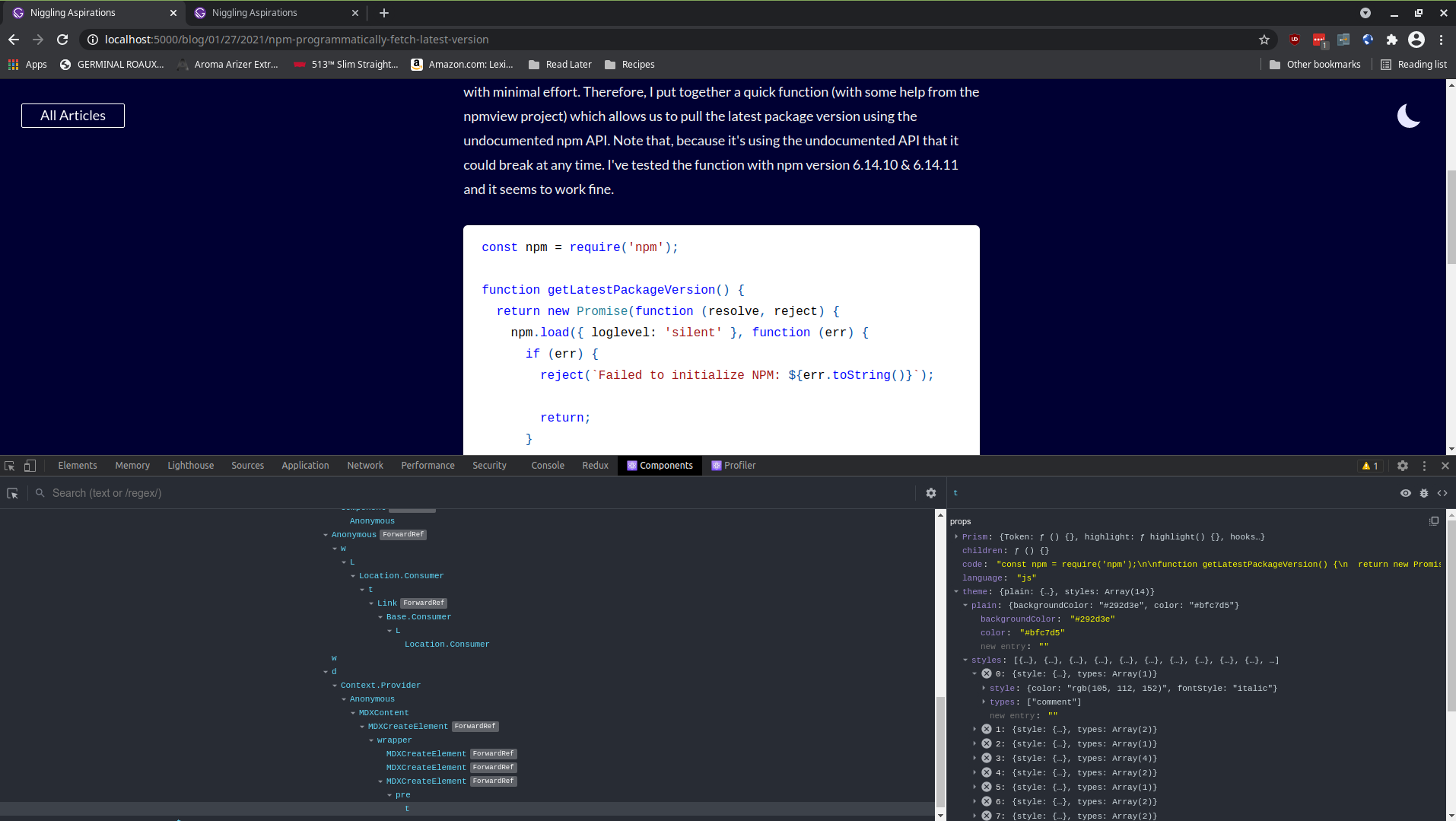
Yet the HTML is incorrect and defaulting to the default light theme (and vice versa if I switch the default to dark):

You can access my repository with this code here:
Thanks!